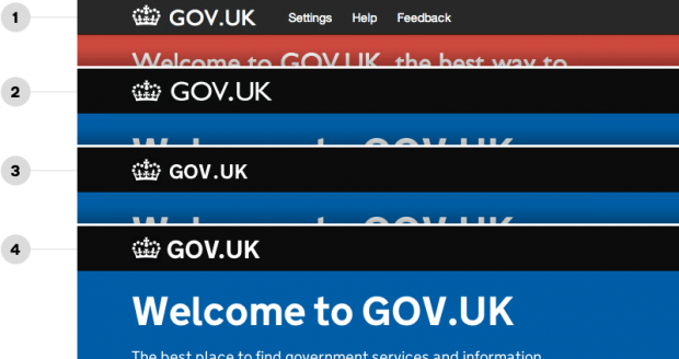
You may not have noticed, but we recently changed the bit that says ‘GOV.UK‘ in the black banner that appears across the website. It now uses New Transport, the same typeface that we use across the rest of the website. Previously it used Gill Sans.
Early versions of GOV.UK used Gill Sans, so it made sense to have the banner using the same typeface. When we changed the website to use New Transport in 2012 we kept the banner in Gill to reassure users that it was the same website as before.
Then we got a bit busy working on more important things, before recently realising that we still hadn’t updated the masthead.
Myself and Alex made a first release of the banner in New Transport at the beginning of January this year. Henrick (who co-designed New Transport) then helped us to finesse when he dropped by the office a couple of weeks ago.
This image shows the evolution of the masthead from early 2012 to today:
Replacing the image file with text gives us a few practical advantages too:
- the text will scale better to different zoom levels, viewport sizes, pixel densities without any real effort on our part
- simpler CSS for print views
- better progressive enhancement for browsers without CSS support or images, which is a bit niche but good to do
