We’ve been working on a project we’ve called Finding Things, which we’re now calling Group and Transform Content. Its aim is to make it easier for GOV.UK users to find the content they need on the site. The results are now starting to become visible to users.
The work we’ve carried out is not just about taxonomy, navigation or search. It’s about working across all these things. It’s about letting users interact with the site better. It’s about breaking down the siloed content. And it’s about letting users easily move around the site in a way they couldn't do before.
As it says in the Government Transformation Strategy we need to ‘transform the relationship between citizens and the state – putting more power in the hands of citizens and being more responsive to their needs’. Our work on GOV.UK will do just this – it will put more power in the hands of our users and it will be responsive to their needs.
The silos had been there since the start
GOV.UK launched in 2012. Which means we’re GDS’s most mature digital product.
But it’s easy to forget how quickly we launched. And how much work we’ve had to do since then. We transitioned 300+ websites onto one platform in 15 months. That meant we didn’t have the time or the opportunity to look properly at how that content fitted together.
And because each organisation’s website moved on to GOV.UK separately, that content came onto the site siloed and has remained siloed. And there are now more than 300,000 individual items on GOV.UK.
A number of interconnecting challenges
This siloed content structure has led to several challenges for users. It means that it is harder than it should be for them to navigate through GOV.UK. It can be challenging for users to find the content they need. And it isn’t always easy for them to work out where they are on the site.
There were three main reasons for this:
- our navigation can be hard to understand
- users aren’t always given a clear indication of where they are on the site
- the tagging system for content – the taxonomy – is too broad for users and not well understood by publishers
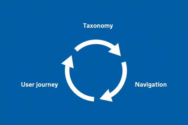
These are all important issues. But they couldn’t each be tackled in isolation. Each one relates to each other. We have to make sure the taxonomy supports the navigation, which supports the user journey, which then has to make sense for the taxonomy.

So it’s fair to say this has been a pretty major project, with lots of moving parts.
Starting with the taxonomy
In 2015 we set up the multidisciplinary Finding Things team to look after this work. It was the biggest single team on GOV.UK. The end goal of this team was to make GOV.UK joined up and really easy for users to understand.
We started by working to create a single-subject taxonomy. So that all content on GOV.UK could be tagged based on the type of subject it covered, rather than the department it came from. We trialled this approach with the ‘education’ topic.
We worked closely with the Department for Education (DfE) and its agencies to create the subject topic and to make sure the navigation would work with this.
We did things like hold a tagathon day, where education publishers tagged more than 3,000 things in one day and fed back on the new taxonomy. And we worked with the DfE and its agencies to audit and improve the content it was publishing. They removed or improved more than 1,000 pieces of content as a result.
This close collaboration was vital because the success of this project will largely be down to the quality of the content – and this content will be provided by departments. So we needed to work with them to make sure the taxonomy and the content were as good as possible.
Redesigning the navigation
At the same time we looked at how we could improve the navigation to make it easier for users to find the content they needed – and to help users understand where they were on the site.
We user-tested several new navigation elements, including:
- introducing a consistent breadcrumb trail with a link showing the user which page they are currently on
- organising topics in a grid so it is easy to see the breadth of content
- iterating an accordion design that had been developed by the Service Manual team
Rolling out the changes and improving the user journey
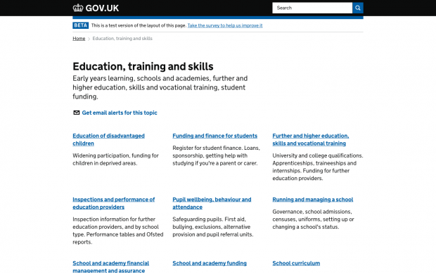
We’ve now launched the new taxonomy in beta. We have a branch the covers the government’s education offering, with all relevant content tagged to it.

The new GOV.UK education topic
We’ve also put the new navigation into A/B testing on the ‘education’ topic. We’ve carried out extensive user research on it, but there are things we can only learn by looking at how the navigation is used. We have set up a performance framework and we’ll be monitoring the results closely and iterating based on our findings.
If this new taxonomy and navigation performs well, we’ll look to roll them out across GOV.UK and bring in more topics and themes. This means we’ll be working closely with government publishers – as we did with the DfE – to ensure that this new approach works for them and to help them improve their content.
And it means users will have a GOV.UK site that takes all of government’s content and makes that content clear, easy to find and easy to navigate around.
Follow Holly on Twitter, and don’t forget to sign up for email alerts.