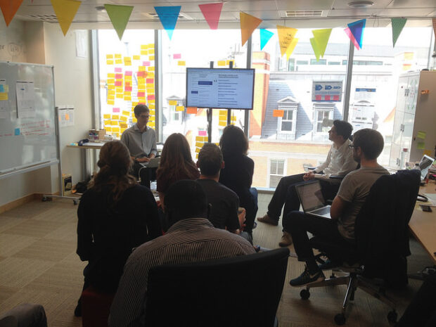
Lots of people ask me what our design process is like at GDS. I thought I’d write some of that down in a place I can point to. It’s worth saying that we don’t follow this slavishly. We’re flexible and we optimise for meeting user need and for delivery. Consistent not uniform. None of this is revolutionary and it’s probably how lots of you work. But people ask, so broadly, this is how we work.
In the GDS design team we have visual designers, interaction designers and front end developers. All of the designers can code or are learning to code. We call ourselves the Design Team because it’s important to belong to a group with shared skills and experiences. This helps people develop their skills, support each other and build a strong culture with shared standards.
Image may be NSFW.
Clik here to view.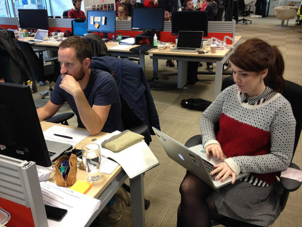
We don’t sit together in a studio or around one table
Designers are embedded within product teams alongside developers, product managers, content designers, user researchers and others. A delivery manager runs their day-to-day workload. Designers are involved in discussions about the product and feedback from users. Designers should observe user research sessions for at least 2 hours every 6 weeks.
Designers sketch on paper
They then build what they’ve sketched in code, either by themselves or with a front-end dev. Sometimes they sketch in InDesign or Illustrator, but that’s rare. We test paper prototypes as well as HTML.
Image may be NSFW.
Clik here to view.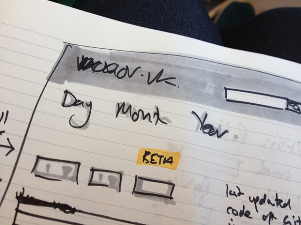
We don’t make wireframes or photoshop mockups
We don’t want a culture of designs being “thrown over a wall” to a dev team. We don’t make “high fidelity mock ups” or “high fidelity wireframes”. We’re making a Thing, not pictures of a Thing.
One of the problems with high fidelity wireframes is that they’re very easy to send around to stakeholders who respond with comments like “Move this up a bit”, or “Make that more blue”. The problem with that is they’re commenting on the picture of the Thing rather than the Thing itself. It’s better to send round a URL and ask people how it works for them. If the shade of blue affects something working, that will be apparent pretty quickly, just as it would be to real users.
Image may be NSFW.
Clik here to view.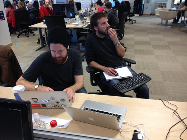
We are agile
For readers from a traditional agency background: we don’t sign stuff off in the same way you might do with a Creative Director. We’re optimised for delivery and a Creative Director can be a bottleneck. Obviously quality is important and it’s my job to make sure design work is of a high standard. But one of the reasons for having a strong culture and a shared mission in the Design Team is to encourage peer review and have a shared standard of design work.
One of the advantages of being truly agile is that you can fix things quickly if they are wrong. One of the advantages of having a shared mission and strong culture is that that rarely needs to happen.
Image may be NSFW.
Clik here to view.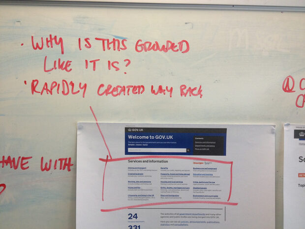
User experience is the responsibility of everyone in the team
We don’t have a UX Team. If the problem with your service is that the servers are slow and the UX Team can’t change that, then they aren’t in control of the user experience and they shouldn’t be called the user experience team. Mike wrote a post about service transformation that makes that very point.
Words are as much the interface as design
Designers work closely with Content Designers thinking about how the words we write affect how easy the service is to use. We wrote about ‘Is what it says and what it means the same thing? here.
Having a specific UX person or team can lead to projects allocating 2 weeks of UX to fix all the user experience issues at the end of the project. This doesn’t work. Again, user experience is the responsibility of everyone in the team. “You can’t interface away bad policy”, as my colleague Leisa once said.
Martha’s report asked us to build one user experience for all of government. The booking system from department X should look and work like the booking system from department Y. We have some established design patterns now, most of which can be found on the design elements page. Lots of the big graphic design decisions have been made. We’re now focusing on applying that to different user needs to continually make things simpler and clearer. Someone described this to me recently as being like a monthly magazine where the basic styles are set but there are slightly different design problems every week.
This works for us, for now. If that changes, we’ll change it.
Image may be NSFW.
Clik here to view.
Image may be NSFW.
Clik here to view.